
Bruins unveil incredible away uniforms
- Brian

- Aug 6, 2025
- 4 min read

Tuesday morning, the Boston Bruins took to social media to unveil their new road uniforms in a video featuring forward Pavel Zacha, and defensemen, Mason Lohrei.
This most recent unveiling comes about six weeks after the team revealed their new home uniforms in a similar fashion - a video featuring assistant captains David Pastrnak, and Charlie McAvoy.

Now, I'm no Sherlock Holmes, but there seems to be a reason for the timing of these releases.
The full home uniforms (along with away jerseys only) were showcased on June 25th, just days before James Hagens and others dawned the new look during the 2025 NHL Draft - the team clearly wanted to debut them for fans before then.
Okay, well what about choosing the morning of August 6th to debut the away uniforms?
Well this is a pure guess by me, but the video game NHL 26 for EA Sports is set to release their full game trailer on August 6th, at 12:00PM E.T.
It's possible that the Bruins as a team, or a Bruins players could be featured in this trailer in white uniforms that the team had yet to fully debut, and the team wants to be the first to display to the public. Or possibly beyond the trailer, perhaps EA NHL socials have screen grabs they could post, or leaks of the game could somehow surface.
Again, it's just a guess but one that could be the reason for a random Wednesday release in early August after the full homes were released back in late June.
ANYWAY
Let's take a closer look at the uniforms - they are in my opinion among the nicest, if not the nicest white uniforms the Bruins have ever had.
FRONT FULL
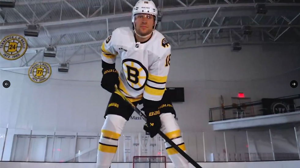
Honestly, this look is pretty much perfection.
Heavily inspired by the Bruins look from the late 70's to the mid 90's - the main (or minor, rather) differences are that there is only one shoulder patch and of a different design, the existence of the subtle rapid 7 ad on the right upper chest, the pant logo, and the socks have a different design.
Here is the inspired by jersey for reference:
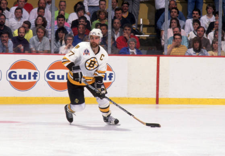
(Photo Credit: B. Bennett - Getty Images)
An absolute classic look dawned by Ray Bourque during the 1990 Stanley Cup Finals.
To be honest though, design wise and taking nostalgia out of the equation, the new white sock design matching the jersey piping looks better in my opinion.
Front Grade: A+ (can't hold the designers responsible for the rapid 7 patch it's out of their control - and the patch is as subtle as an ad logo could be)
BACK FULL

No notes, incredible.
The black base font outlined in gold perfectly accents, and contrasts the prominently gold jersey piping.
Back Grade: A+
SHOULDER PATCH

Many Bruins fans, myself included, craved the return of the "meth bear" shoulder patch.
However, after the reveal of the jerseys in late June, we knew that wasn't going to be the case.
That said, this is as good of a shoulder jersey design I can think of outside of the meth bear.
So well done, Boston.
It's a great modern twist on a mainly retro design.
The only thing that's interesting is only having one shoulder patch on the left, but none on the right.
Shoulder Patch Grade: A
SOCKS

As mentioned above, this sock design is even better than the original uniforms they were inspired by - which is something I never thought I would think.
The socks matching the jerseys, both having an elite pipe design is just uniform gold.
Now the reason some fans aren't saying the same for the home uniforms which have the same concept of the socks matching the jerseys, is because it meant no return to gold socks with black jerseys - a look Bruins, and hockey fans alike admire.
Still, the sentiment around the Bruins home uniforms is that they too are near perfect, and as good of a Bruins dark uniform as there could be while using black socks.
The Bruins have also been wearing black socks at home since 2017-2018 so fans are already used to the idea - even those who prefer yellow socks believe the new black socks are an upgrade over the previous black socks.
The white uniforms have always been all white, so less debate over base color of the away uniforms.
And i'd be willing to bet most of the nostalgia crowd, like myself, would admit these new white socks are better than the ones worn from the late 70's to the mid 90's.
Sock Grade: A+
Overall, these uniforms really are incredible and are instantly among the best away uniforms in the NHL, and rank all time among Bruins white uniforms in their franchise's 101 year history.
Absolutely can not wait to see these in action, and hopefully at home some day, but that's an article for different time!
You can additionally see a closer look of these uniforms in professional taken photographs on the Boston Bruins social media here: https://x.com/NHLBruins/status/1953096807803707508


Comments